

New Yahoo Logo: Over 66 Percent Of People Prefer Original Yahoo Logo Over New Yahoo Logo

Yahoo has picked a new corporate logo, but many people prefer the one they just did away with.
According to a poll conducted by Polar, 786 participants indicated that they prefer the original Yahoo (NASDAQ:YHOO) logo, while only 346 respondents indicated that they prefer the new Yahoo logo. The data is accurate as of this writing.
Matti Leshem, CEO of marketing strategy agency Protagonist, had this to say on Yahoo's logo experiment.
"Yahoo's 29-day design odyssey should have been a serious head-fake wowing us with something completely different on day 30. Instead they just showed us another version of a purple logo. All 30 logos were relatively uninspired and in fact, if you had to choose another one of these, they should have gone with day 4, or 24. The good news is that while the opportunity was missed, it probably won't hurt them. They are doing as well as ever and hopefully Marissa Meyer's vision will continue to put the company on an upward path with more meaningful traction," Leshem said.
We agree with Leshem. We wouldn't be surprised if people completely forgot that Yahoo chose a new logo to begin with fairly soon. At the end of the day, it'll be Yahoo's products and services, like their popular Fantasy Football and Fantasy Baseball offerings, that will determine whether the firm will sink or swim.
What do you think? Which logo do you prefer? Sound off in the comments below.
© Copyright IBTimes 2024. All rights reserved.
-
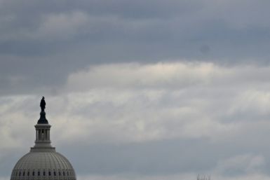
Ukraine, Israel, TikTok: The Massive Aid Package Before US Congress
-
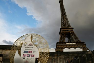
Eiffel Tower Loses Sparkle For Parisians Ahead Of Olympics
-

Former Number One Momota Retires From International Badminton At 29
-

Why Insurance Prices Have Skyrocketed
-

World Bank Aiming To Connect 250 Mn Africans To Energy Grid By 2030
-
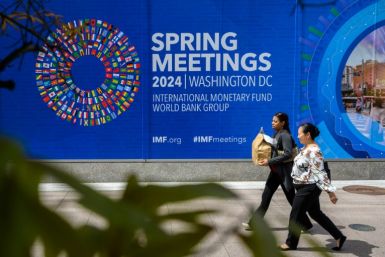
IMF Says Global Debt Levels Face 'Great Election Year' Risk
-

Divisions Among Colombia's FARC Dissidents Complicate Peace Talks
-

French Far Right Gets Youthful Vibe With 28-year-old Leader
-
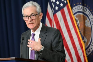
US Fed's Powell Says Inflation Fight May Take 'Longer Than Expected'
-

Mideast-related Oil Price Spike Threatens 'Relatively Good' Economic Outlook: IMF Chief Economist


