

Tinder's New App Update: How To Message Matches, Select Bigger Profile Pictures
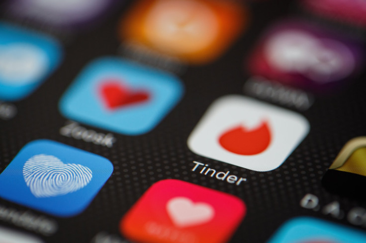
Tinder introduced a redesigned version of the app on Tuesday that puts more of an emphasis on user photos in the app rather than on their short descriptions of themselves called "bios." The new design also changes the way users can flip through photos of potential matches.
The design integrates the tapping motion popularized by Snapchat and now Instagram stories. To flip through someone’s photos users simply have to tap the edge of the photo they’re currently viewing. Now to see a user’s full profile, potential matches have to tap the bottom of the photo card.
Read: How To See Who Swiped Right: Tinder Gold Subscription Shows Who Already Likes You
This motion will pull up the bio of the person (if they’ve written one), their Anthem, their top artists and their Instagram feed. “Now, photos take up more real estate on Tinder—extending to the edge of your screen and giving you the bigger picture when it comes to your potential matches,” said a blog post from Tinder about the update.
But some users are struggling to adapt to the new design. Tweets from users show that some of them are having a hard time finding how to message their matches and find out more information on potential matches.
Read: Dating App Tips: When Should You Send That Second Text? Hinge Wants To Help
To message a match on Tinder, users have to select the overlapping chat bubbles that appear in the upper right corner of the screen. Selecting this bubble will open current conversations as well as all matches. Tapping a match’s photo will open a new conversation with them. The message button may not be visible while viewing the biography of a match, to get rid of this, tap the down arrow on the photo, and the message bubbles should reappear at the top of the screen. But remember, you can only message people you’ve matched with, meaning you both “liked” one another in the app.
Swiping right will still count as a yes swipe and swiping left still counts as a no, while swiping up is a “super like” so be careful when trying to exit the bio of a potential match to only swipe up if you want to “super like” them.
The app’s icon also changed a bit with the new update, something users on Twitter were also commenting on.
The change in the logo isn’t drastic, the red and white swapped positions and the red/pink color now has a gradient similar to other apps like Instagram.
The redesign comes just a few weeks after the app introduced "Tinder Gold" a paid version of the app that allows users to see who already liked them before swiping. The "Gold" version is an addition to the Tinder Plus subscription the app already offered users.
© Copyright IBTimes 2024. All rights reserved.
-

Mass Cancellations Loom Despite French Air Union Cancelling Strike
-

Recycled 'Zombie' Misinformation Targets US Voters
-

Hackers Leak Part Of Source Code Of El Salvador's Bitcoin Wallet
-

Azerbaijan Says 'Closer Than Ever' To Armenia Peace Deal Amid Border Talks
-
How UK's Biggest Water Supplier Sank Into Crisis
-

Taiwan Hit By Dozens Of Strong Aftershocks From Deadly Quake
-

Gaza Health System 'Completely Obliterated': UN Expert
-

In Ecuadoran Amazon, Butterflies Provide A Gauge Of Climate Change
-

'Thank You, America:' Zelensky And Netanyahu Applaud House Passage Of Foreign Aid Package
-

Women Journalists Bear The Brunt Of Cyberbullying


