

US Income Inequality: The Vast Disparities In Boston, Los Angeles, San Francisco, Chicago, New York and Miami [Maps]

Recent reports show U.S. income inequality is at a record high, and nowhere is that more apparent than in the country’s biggest metropolitan areas.
To illustrate, artist Nickolay Lamm created these "visualizations" showing extreme disparities in income in six major American metropolitan areas: Boston, Los Angeles, San Francisco, Chicago, Miami and New York.
Here’s his methodology:
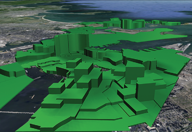
I used a map of net worth of Boston, Chicago, Los Angeles, Miami and San Francisco to create 3D bar shapes that correspond to the net worth in each section of the map. So these "before" and "after" images show what the world would look like if buildings were as tall as its residents were wealthy. For example, if one section had a net worth of $500,000, the height of the 3D bar shape for that section was 5 cm. If one section had a net worth of $112,000, the height for that section was 1.12 cm.
Here are Lamm’s visualizations. Drag the slider to see the city with or without Lamm’s 3D chart:
Boston:
Chicago:
Los Angeles:
San Francisco:
Miami:
New York:
Check out the rest of Lamm's Wealth Inequality Project here.
© Copyright IBTimes 2024. All rights reserved.
-

IMF Says Global Debt Levels Face 'Great Election Year' Risk
-

Divisions Among Colombia's FARC Dissidents Complicate Peace Talks
-

French Far Right Gets Youthful Vibe With 28-year-old Leader
-

US Fed's Powell Says Inflation Fight May Take 'Longer Than Expected'
-

Mideast-related Oil Price Spike Threatens 'Relatively Good' Economic Outlook: IMF Chief Economist
-

Wine Growers 'On Tip Of Africa' Race To Adapt To Climate Change
-

Despite Olympic Truce, Games Wrestle With Political Fallout
-

What Will The Fed Do With The Latest Inflation Numbers?
-

US Retail Sales Up More Than Expected In March
-

Alexandre De Moraes: Brazil Judge In Feud With Elon Musk


