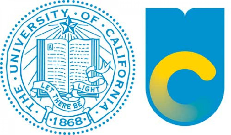
New UC Logo Outrages Students and Alumni

The new logo for the University of California has not been well recieved by students and alumni.
Originally introduced six months ago, the logo that features a large "U" that mimics the looks of an open book at the top and a "C" in at the bottom interior is now being made more visible throughout the public university's websites and publications.
University of California officials reportedly stated that they were aiming toward projecting a "forward-looking spirit" with the new logo; however, current and former students seem to prefer the tradition of the seal that has represented the institution since 1868.
"To a generation all too familiar with circular, fading loading symbols, this is an attempt to be revolutionary. But it comes off as insensitive," 21-year-old UC Irvine senior, Reaz Rahman told the Los Angeles Times.
"To me, it didn't symbolize an institution of higher learning. It seemed like a marketing scheme to pull in money rather than represent the university."
Rahman has started an online petition urging the university to reinstate the old logo. While other students have expressed their distaste via social media platforms.
"New UC logo is an abomination. Back to the drawing board," one person tweeted.
"Whoever signed off on this UC logo should be forced to have it tattooed on their forehead for life," another suggested on Twitter.
Tomo Hirai, a 24-year-old UC Davis graduate modified the logo in Adobe Photoshop so that the C would go in an unless circle, reminiscent of loading icons for computer operating systems such as Windows or OSX, and shared his graphic online.
"It cheapened the entire UC System," Hirai said of the new logo. "That's not what you do to 144 years of history."
Some; however, feel that the reaction of outrage at the new logo is normal.
Kali Nikitas, chairwoman of the graduate program in graphic design at the Otis College of Art and Design in Los Angeles suggested to the Times that with the new logo comes a disconnect of routine to which students and alumni are responding.
Nikitas says as people become accustomed to the new symbol, within a few years it will no longer be an issue.
Jason Simon, the UC system's director of marketing communication told the Times that the school does not currently plan to change the logo, but suggests that it be receive further updates over time.
© Copyright IBTimes 2024. All rights reserved.
Join the Discussion
Editor's pick


