

NFL Schedule 2014: The Formula Behind Who Your Favorite Team Plays, Visualized


Ever wondered how the NFL manages to expertly construct a 17-week schedule for each of its 32 franchises on a yearly basis? A new series of graphics allows for a simplified look at the league’s process.
A self-described “big sports and NFL fan,” freelance web developer and data visualizer Chris Polis knew that the NFL used a scheduling formula, but sought a way to present the finished product in a streamlined, easy-to-understand way. “I was going through some of the schedules and started thinking of a better – or at least another way to present this data,” Polis told International Business Times in an email. The web developer’s NFL schedule visualization for each of the league’s 32 teams can be viewed here.
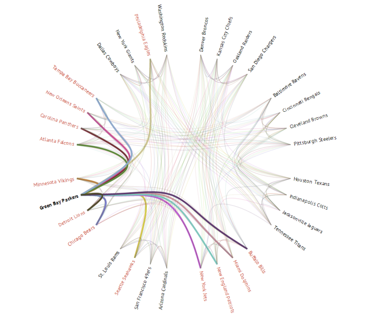
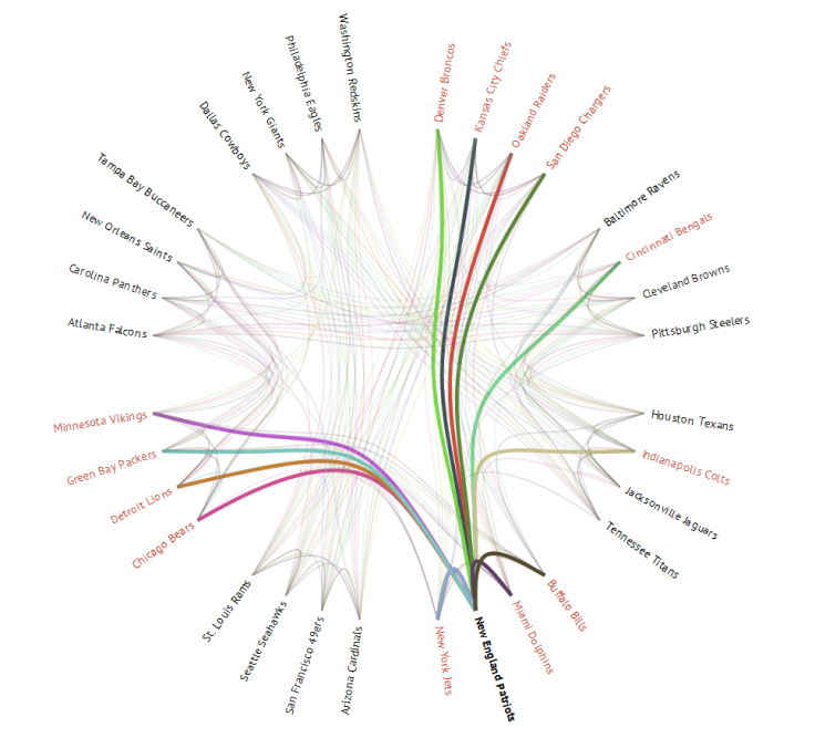
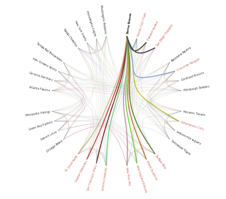
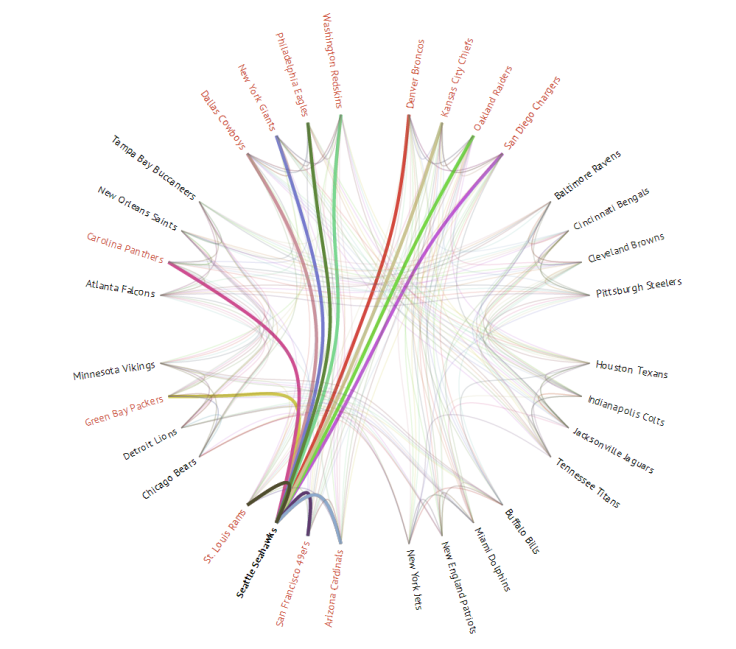
Each year, the NFL uses the same formula to determine which teams will face off during the regular season. Teams play each of their division rivals twice, all four members of an unrelated NFC and AFC division once and two games against random teams from within their conference. In crafting his unique visualizations, Polis was motivated by a desire to display that formula -- as well as a team’s entire schedule -- in a unique way, as compared to the typical, week-by-week breakdown in which NFL schedules are normally presented.
“Traditionally, you can only view all the games of a particular team for a given week; you can’t see connections between teams and divisions or across multiple weeks,” he said. “This visualization is what I came up with – displaying all games with interactivity to drill down by week or team (instead of just looking at different tables), grouping by division and coloring links by week.”
“My biggest takeaway is that you can easily see the formula that the NFL uses to build schedules,” Polis added. “I knew there was a formula before building this, but wasn’t sure what it was.”
Polis routinely uses his data visualization skills to simplify complex fields of information. For example, he developed a chart in March which shows the correlation between an NCAA basketball team’s seed in the annual March Madness tournament and the probability that it would advance to the next round. The rest of Polis’ creations can be found at ByteMuse.com, his personal website.
In addition, a few examples of his work can be found below.
© Copyright IBTimes 2024. All rights reserved.
- MOST READ


