

Size Matters (For Fonts), Scientists Say
Reading larger words provokes a stronger emotional effect in the brain than the same words presented in smaller type, according to a new study published Wednesday in the journal PLoS ONE.
Scientists from the University of Gottingen and Humboldt University of Berlin examined how varying the font size of words changed the fluctuations of brain activity observed on an electroencephalogram.
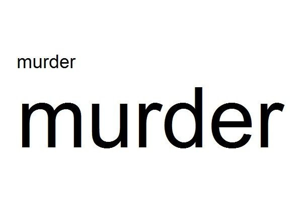
They showed 25 participants 72 different German words in either 28-point Arial or 125-point Arial while they were wired with electrodes. The words included those with positive associations like Geschenk (gift) or Partner (partner), neutral words like Stuhl (chair) or Dokument (document), or negative words like Mord (murder) or Krankheit (disease).
When the subjects saw a positive or negative word in larger font, the scientists could see certain emotion-related effects in the brain registering earlier and lasting for a longer time on the EEG. It seems as though in larger fonts, positively-associated words registered more positively, while negative words registered more negatively.
The effect happens once you understand the meaning of the word. As soon as the brain knows whether a word is positive or negative, there is an attention allocation that enhances the sensory encoding and processing of the stimulus, lead author Mareike Bayer said in a telephone interview.
Changing the font size for neutral words did not provoke a stronger emotional response, but subjects paid more attention to them when they were displayed in larger font.
In general, there's more attention to large fonts, and this attention is further enhanced by emotional content, Bayer said.
Size was the sole focus of the current study, but additional researcher has found that fonts can influence perception in other ways.
In a 2011 paper published in the journal Cognition, researchers from Princeton University and Indiana University found that that people were more successful at memorizing information when they were given flash cards written in italized Comic Sans, as opposed to the easier-on-the-eyes Arial.
The researchers also conducted an additional experiment in which they changed the fonts used on worksheets and slideshow presentations given to 222 high school students in different sections of six different subjects.
They found that the students in the classes that used materials with the more difficult fonts, like Comic Sans or Haettenschweiler, performed better on tests, on average, than the students that learned with the easier fonts.
There's still work to be done - we still don't know how font size and other factors provoke different kinds of emotional reactions.
Whether your heart beats more when you get a love letter in big font, this we cannot say from this study, Bayer says.
© Copyright IBTimes 2026. All rights reserved.
- MOST POPULAR IN Science


