Do You Live In An iPhone Or Android Neighborhood? Find Out With This Interactive Map

Do you live in an iPhone neighborhood or an Android neighborhood? It’s hard to guess, but with a new animated map from MapBox, you can explore exactly which mobile operating system dominates your neighborhood, or anywhere else in the world, for that matter.
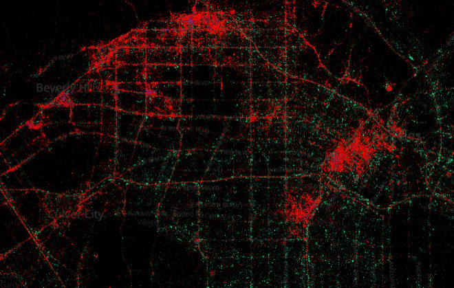
To create the interactive map, MapBox engineer Tom MacWright and data artist Eric Fischer collected 3 billion tweets – every geotagged post on Twitter since September 2011 – and superimposed the tagged locations on an interactive map. The results show which mobile devices users made at the time of the post, tagged as “iPhone,” “Android,” “Blackberry” or “Other.” For the most part, iPhones and Android devices make up the majority of the map. The mobile phone map was released alongside two other interactive maps from Mapbox: one exploring the languages of Twitter and another examining the divide between tourists and locals.
The results can be slightly deceiving, though. At certain zoom levels, the maps display markers for iPhones on top of markers for Android devices, making the shift between the two seem a little less balanced. But simply zooming in closer to street level corrects the problem, making the iPhone seem less unfairly popular.
And when you zoom in properly, there are some excellent insights available with the map. For instance, looking at Washington, D.C., reveals that the entire downtown center is largely dominated by iPhones, but moving out to the eastern sides of the city, Android phones become much more prominent. Similarly, downtown Los Angeles and the Hollywood Hills are largely iPhone-dominant, but Android devices take over in the city’s southwest. In many ways, the iPhone/Android divide is indicative of larger economic divides in those same cities.
“There is certainly some experimentation involved,” Fischer told Wired of the map. “I didn’t know whether there was going to be any pattern to the distribution of phone brands and was surprised to see how well it correlated to economic divisions in some cities."
The map is similar to another project Fischer completed in 2010, breaking down the locations tagged in Flicker photos by tourists and locals. The results were somewhat obvious – Times Square in Manhattan was completely dominated by tourists, for instance – but incredibly engrossing to play with.
Still, Fischer sees his new iPhone/Android map as a more illuminating project without some of the inherent biases in a map based on Flickr data. As Fischer explains, people tend only to take pictures of exciting places or events, which can skew the results somewhat. Because Twitter is more casual, it can provide a more accurate picture of the split between Androids and iPhones.
“Twitter reaches a bigger slice of the population than Flickr does, both in total numbers and in demographic breadth, but the other thing that is different is that it is more representative of those people’s complete lives,” Fischer explained to Wired. “Taking pictures is something that people generally only do when they see something significant, but responding to messages on their phones is something that they do whenever they have a spare moment, wherever they are.”
“We’re still only seeing a tiny fraction of all that is happening, but it’s a clearer picture than I’ve ever seen before.”
© Copyright IBTimes 2026. All rights reserved.
- MOST POPULAR IN Mobile