

Where Does Chris Christie's Logo Fit In Presidental Pack? Ranking The Good, Bad And Ugly

Chris Christie has announced he's running for president and released a website and logo for his upcoming presidential run. Christie is entering a crowded field of Republicans and Democrats hoping to become the next commander-in-chief. But one thing everyone seems to have an opinion on is the candidate's logos. Remember all the Hillary hate? And all the Jeb hate?
There are some pretty great logos among the candidate lineup and some that are pretty bad. And some we didn't include people because Rick Perry and Lindsey Graham didn't make their logos easily accessible. Not shareable in the age of social media? Immediate fail.
Bad logos
16. George Pataki
www.GeorgePataki.com
Posted by George E. PatSoaki on Thursday, May 28, 2015
What is up with this logo? The font is wrong, and the flag is missing a whole bunch of stripes and stars. Yes, we get creative license, but this might be going too far.
15. Lincoln Chafee
Posted by Lincoln Chafee on Wednesday, May 13, 2015
Chafee’s logo just looks bad. Really. The circle and the stars are great, but what is up with that green outer circle? Do you see it? Why green? It’s not like Chafee is running with the Green Party. Perhaps someone thought, “'Fresh?' Why not green?” But still, it doesn’t work.
14. Mike Huckabee
Posted by Mike Huckabee on Tuesday, May 5, 2015
Why is this a misshapen check mark? That seems awkward and the yellow stars don’t really work. Yes, it’s clearly a reference to “hope” and “higher ground,” but it could be better.
13. Ben Carson
Posted by Dr. Ben Carson on Thursday, June 18, 2015
There are just too many colors in his logo. Why are there two shades of blue? Props are needed for the “Heal, Inspire, Revive” line, though. In case you didn’t know, Carson is a doctor.
12. Donald J. Trump
Posted by Donald J. Trump on Wednesday, June 17, 2015
Honestly, we were expecting more from "The Donald." Maybe a logo made of pure gold or covered in 100 dollar bills? But this logo is just a bit plain. Obviously, the message is clear: Who do you need to impress when you’re Donald Trump? So thumbs up for the chutzpah.
Acceptable logos
11. Bobby Jindal
Posted by Bobby Jindal on Wednesday, June 24, 2015
"J is for Jindal." Clever. Really, no one thought of that before. Yet, aside from the obviousness, the red, white and blue demonstrate the required amount of patriotism, so this one is fine.
10. Carly Fiorina
Posted by Carly Fiorina on Monday, May 4, 2015
Fiorina’s logo is fine, but drab. It gets the job done, but people might be confused about who Carly is.
9. Ted Cruz
Posted by Ted Cruz on Tuesday, June 2, 2015
Cruz got a jumpstart on everyone by being the first person to announce a run for president. However, this logo seems a bit confusing. What’s going on here? Is this a flame? A tear drop? Both? Neither? The dark background is a nice change of pace, but some clarification would be useful.
8. Bernie Sanders
Posted by Bernie Sanders on Thursday, April 30, 2015
Sanders got real with this logo. It doesn’t feel like he should be addressed as Sen. Sanders, but rather as “Bernie!” -- the friendly guy from your neighborhood bar.
7. Jeb Bush
Posted by Jeb Bush on Sunday, June 14, 2015
Bush took a lot of heat for this logo, with many suggesting it was something out of the 80s. Yes, the exclamation point is awkward, but it’s apparently his thing. You can’t fault him for that.
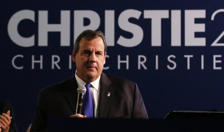
6. Chris Christie
Looking at Christie’s logo, it seems perfectly fine. It has a bold "Christie" with thinner 2016 and clearly his slogan "Telling It Like It Is." It's patriotic. Simple. Easy to read. Not bad. Not bad at all.
5. Marco Rubio
Posted by Marco Rubio on Monday, April 13, 2015
Rubio’s logo is fine, although it looks like someone forgot to use the shift key when typing. Yes, obviously he’s going for the youthful, “Look at me, I’m like the kids who don't use capital letters.” But, when you put the country on top, it doesn't work as well.
Good logos
4. Martin O’Malley
Posted by Martin O'Malley on Saturday, May 30, 2015
O’Malley’s logo is bold and square. The value of the square shape can’t be overstated. It does the requisite red, white and blue, so good job there. However, the “O’M” logo seems like it might be a bit hard to know who the logo is for unless you’re already familiar with O'Malley.
3. Hillary Clinton
Posted by Hillary Clinton on Friday, May 1, 2015
Clinton received a lot of hate when she released the right-thrusting H, even if that is abating. Some people. however, said that it would play well with social media types and that has proved accurate. Likewise, the Clinton campaign has found creative ways to use it, like by putting celebrities in the H.
2. Rand Paul
Posted by Rand Paul on Monday, April 6, 2015
Honestly, this is one nice logo. It's hard to tell what exactly Rand is doing with this, but there's a torch and his name, so A+ there.
1. Rick Santorum
Posted by Rick Santorum on Wednesday, May 27, 2015
Santorum put a bird on it! An eagle to be exact! He definitively gets some points for that. The rest of the logo does it's job fine, but that bird!
© Copyright IBTimes 2025. All rights reserved.
- MOST READ


