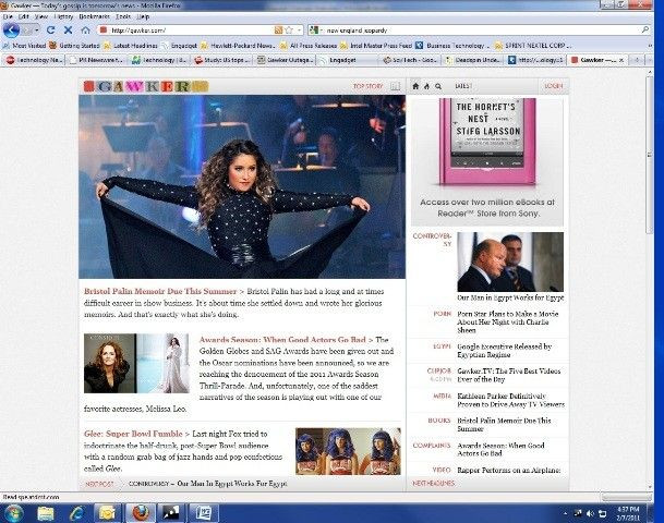
Gawker Changes Websites’ Layout; Gets Torched Via Twitter

Gawker Media, the company behind popular media sites like Gawker, Deadspin and Gizmodo, introduced a new layout design today.
The design rids the Gawker sites of their blog feel and adds more of an aggregated news look. On the sites' homepage, instead of a list of stories with small thumbnail images; one giant article is listed on the front of the page and the list of stories is on the side. The company said in a post on its Life Hacker website that the move comes for several reasons, including a shift in the company's content base from snarky comments on previously reported news to breaking stories themselves.
Gawker also cited the rising importance of video and visuals and rounding the company's changing image as more than just a blog in the Lifehacker post explaining the design shift.
Yet, if the early feedback on Twitter is an early indication, Gawker might want to reconsider. One Twitterer, @juice49 or Ashley Stevens, represented the majority when she wrote, @Gawker what did you do to your websites? That's one nasty redesign. Another Twitterer, @marcsnitz or Marc Snitzer wrote, Wow @Gawker, way to ruin your website format.
The responses were similarly aimed at Gawker's sister sites, Deadspin and Gizmodo. Gawker does have the option of letting users return to the old format. However, it isn't completely the same as the old format, since the sidebar remains.
Gawker did not respond to an inquiry for comment.
To contact the reporter responsible for this story call (646) 461 6920 or email g.perna@ibtimes.com.
© Copyright IBTimes 2025. All rights reserved.


