Twitter Update: New Redesign For iOS App Brings Much Simpler Look
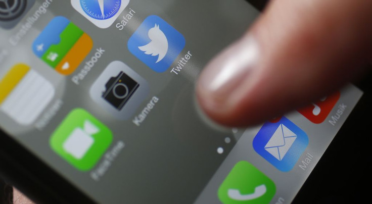
Twitter has begun rolling out an update to its iOS app and introducing a redesigned user interface. The new Twitter app for iOS is now easier to use with less tabs while placing all other settings into one location.
The new Twitter app for iOS devices now come with four tabs instead of five. By default, those tabs are for Home, Search, Notifications (Mentions) and Direct Messages, according to Engadget. The ‘Me’ or Profile tab has been removed.
Instead of a tab, users can access their profile and other setting by tapping on their icon that’s on the top left corner of the app. This also opens up a new side navigation menu where user can access their settings, privacy options, lists and moments.
These changes may already be familiar to some users because this user interface was already made available for the Android version of the app last year. Twitter may have liked the response it got from Android users, so it just seems like a logical change for the iOS version of the app.
“Today, with lots of feedback and ideas from you, we’re refreshing our product too and making it feel lighter, faster and easier to use,” Twitter said on its blog. “We listened closely and kept what you love. And for the things you didn’t, we took a new approach to fix and make better.”
The Twitter app for iOS devices also comes with a refined typography that makes the overall look more consistent with the other changes. Profile photos are now round instead of square, while headlines for articles are bolder.
Articles and website links now will open automatically in Safari’s viewer within the Twitter app when users tap on them. Previously, website links opened with Twitter’s in-app browser, as pointed out by the Verge.
The updated Twitter app for iOS also now supports Safari’s Reader View. This removes all ads and extra images on the page so users can just focus on reading an article. The Twitter app’s accessibility setting on iOS also come with stronger color contrasts for those who are visually impaired, BuzzFeed reported.
Some of the changes that Twitter is introducing also appear to be the company’s way of making its app more easily usable for newcomers. The reply icon, which was presented as an arrow, has been mistaken by people for delete or for going back to the previous page. Twitter has now changed the reply icon with the more familiar speech bubble symbol.
Twitter also says the updated iOS app now can automatically update tweets, replies, retweets and likes without having to refresh the page. This means that users will be able to see real-time updates about their tweets.
Twitter says it intends to bring some of these changes to its desktop website, TweetDeck and Twitter Lite “over the coming days and weeks.” For users who want to get the updated Twitter app for iOS, they need to update the app to its latest version (ver.7.0). The redesigned app might arrive sometime later for some users as Twitter appears to be still rolling out the changes.
© Copyright IBTimes 2026. All rights reserved.
- MOST POPULAR IN Technology