Apple, Chinese Food co. at Loggerheads Over Logo Design

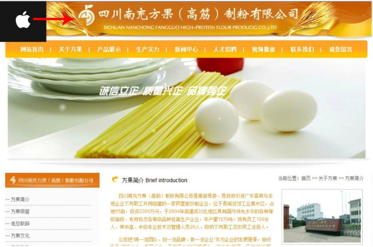
A Sichuan, China-based food company whose logo looks strangely similar to Apple's has landed itself in a trademark-infringement lawsuit.
The logo of Sichuan Fangguo Food Co.Ltd. looks similar to Apple's logo as they both look like an apple and come with the leaf. However, the logos are not identical or even deceptively similar. Fangguo's logo, which is a circle with three-quarters of the bottom left missing, is meant to resemble an apple, with its stem and right-facing leaf.
The logo was created by a Beijing-based design company in the 1980s and it originally was used by a state-run company in Nanchong, Sichuan Province. The logo was transferred to Fangguo in 1997.
The same year, in August, Fangguo had applied for the trademark of the logo, which ran through 2007. In 2007, the company applied for an extension of the trademark till Aug. 19, 2017. And though Fangguo is a food company, it has filed for extension of their trademark into new product categories, including notebook computers and electronic-game software. Not surprisingly, it came under Apple's radar.
Fangguo has received a letter from a Beijing-based law firm, which on the behalf of Apple, asked it to remove the apple leaf from its logo and make its trademark in technology related categories void. The company has time till Aug. 6 to respond to the complaint.
However, Fangguo CEO Zhao Yi isn't taking the matter seriously and feels Apple is harassing the company. He claims he didn't know of Apple when he started the company and wanted the logo to resemble a fruit because his company is into food processing business.
Zhao also said Fangguo doesn't have any specific plans of entering into technology business but hasn't ruled out the idea if an opportunity presents itself and hence the company had broadened the category of trademark.
Zhao said he's confident that Apple's complaint will not stand as the logos of the two companies are completely different.
Fangguo's logo, Zhao said, comtains two Chinese characters and the orientation is also different. Ours is a totally different shape, Zhao said.
Zhao also pointed out that if the apple leaf is removed from the logo as demanded by Apple, the logo would look like a bomb.
It may be possible that Apple is simply bullying Fangguo as Apple has rarely used red color on its logo. Moreover, if the logo was created in 1980s, it is highly unlikely that it was a rip-off of Apple logo.
© Copyright IBTimes 2025. All rights reserved.


