Google Update Shows It Really Wants You To Click On More Ads
KEY POINTS
- Google changed the way Search Results look in Chrome
- The new look blurs the line between ads and URLs that aren't ads
- The changes seem to imply that Google wants people to click on the ads
Google updated the search results on the Chrome browser to add details that will help netizens know where certain information displayed on the screen comes from. A week later, however, some have noticed that it doesn't really work to that end.
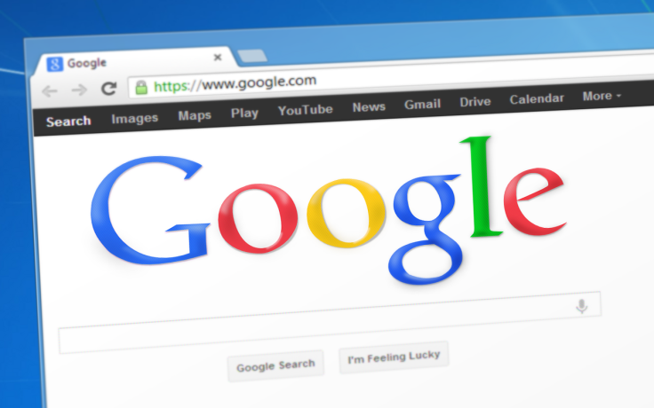
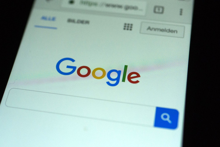
Last week, Google updated Chrome so that search results will be displayed in a different way. The update added favicons that will indicate where the results actually came from. The Verge gave an excellent comparison as to how the new and older search results screen looks like: the old and new looks appear similar, and are only differentiated by the small icons to the left of every link.
In a blog explaining the changes, Google said this change in the search results screen is meant to help users “understand where the information is coming from and what pages have what you’re looking for.” Indeed, the small favicons do indicate where the links lead to, but the icons aren't what's annoying people.
According to Digiday, in addition to favicons, Google also added an icon indicating that a certain URL is an “ad.” The “ad” icon looks similar to other favicons, and this is where the problem lies. Brooke Osmundson, associate director of paid search for NordicClick, a pay-per-click agency, told Digiday that ads don't look like ads anymore.
“What an ad looks like has gotten more subtle over the years,” Osmundson said. “It’s started to blur the lines between what users thought was an ad or wasn’t.”
The new design is strikingly different from how Google's search results looked like a few years ago. Google, up until 2013, used to indicate that a certain link is an ad using a bold, yellow-colored “ad” icon, Search Engine Land reported. A redesign after this placed ads inside a box that used a different color for a background. These designs still made it easy for people to spot ads.
The recent redesign, however, doesn't use a different background. The “ad” icon is almost undistinguishable from other favicons at first glance as well. Google's new design simply made it harder for people to identify ads.
© Copyright IBTimes 2026. All rights reserved.
- MOST POPULAR IN Technology