

Reading Candlesticks: A Basic Guide
Candlesticks are a symbolic representation of the price action of an asset during a specific period of time, and they display the high, low, open, and closing prices of the said asset.
To trade any cryptocurrency pair, traders make use of data from price-tracking websites that have charts and candlesticks integrated into them, a method introduced to the world by Japanese trader Munehisa Homma.
These candlesticks are associated with a timeframe and have several uses in the crypto industry.
First, it is imperative to decide what timeframe you are trading on. There are candles of various lengths in the market that can help you trade extraordinarily well. The most-used ones are the daily candle, the weekly candle, the monthly candle, and the 6 monthly candles. Each candle's length depends on its timeframe. For example, a daily candle ends within 24 hours.
There are broadly two kinds of candles in the crypto world: red and green. While you can change the color later on, the industry-standard usually says that red means bearish candlestick and green means bullish.
Each candle can be further divided into multiple parts. First is the upper shadow (wick), then the body, and lastly, the lower shadow (wick). The diagram below can be seen for reference. Also, as mentioned above, the body of the candle represents the timeframe of trade, i.e., a 5-minute candle will display 5 minutes of price action.
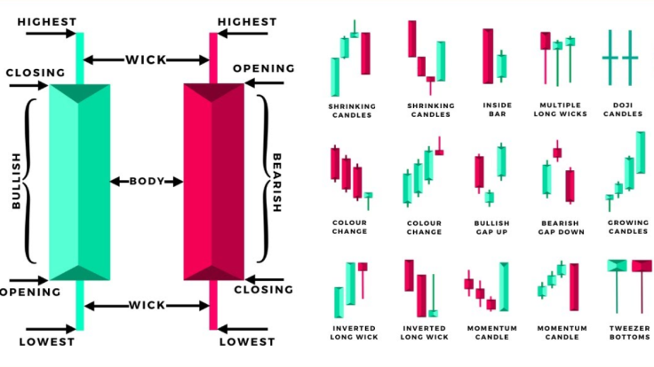
A red candle, i.e., the one bearish in nature, starts from above and traverses downwards, creating a downtrend. Since the crypto market is bearish nowadays, such candles have become quite common and indicate that the price action for the trading pair in question is being dominated by the bears. On the contrary, a green candle starts from below and makes its way up and is fairly common in bullish market cycles.
The wicks of these candlesticks are of great importance to traders. The wicks can be formed on both sides or one side. Depending on its length, one can slightly predict how the next candle might turn out to be. But one must remember that the crypto market is inherently volatile and candles are not the sure-shot way to predict the price trajectory of a trading pair.
The candle seen in the image below is green, i.e., bullish, confirming that the opening price was lower than the current price. The price went up to a certain point but failed to capitalize and traders jumped in to take profits. As a result, the length of the candle dropped down to where it is in the image after making a high at the tip of the wick.
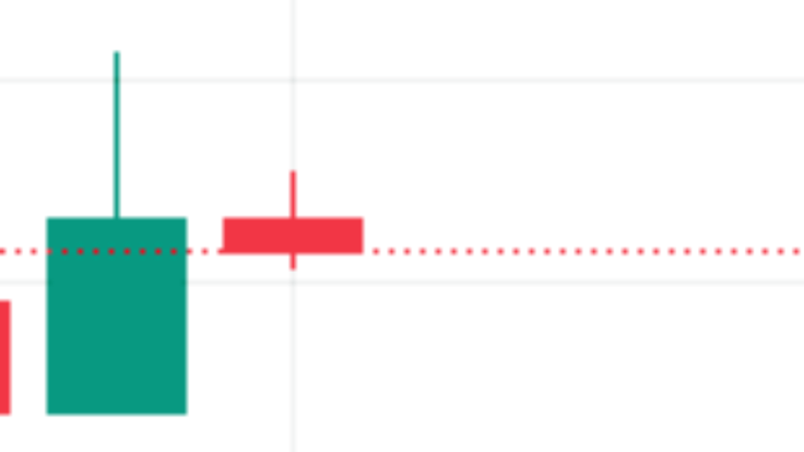
This indicates that as soon as the price touched the tip of the wick, selling pressure was triggered, meaning this was a resistance zone for the token. Another crucial fact here is that the candlestick that will follow this one will be bearish. While this may not be true most of the time, it is true in this case. The logic is that the bulls do not have enough power to push the prices higher.
A similar logic can be applied to the chart below. This is a far more complex price action of the current BTC/USD daily chart, and the first candle from the left has wicks on both sides. This means that it opened at a relatively higher price than the daily close and went up to a certain point (the upper wick) where the traders cashed in their profit.
As a result, the sellers took control, and the candle dropped to its daily low (the lower wick). Taking advantage of lower prices, the traders once again bought BTC, and it went slightly up but remained below its opening price.
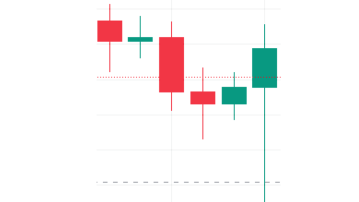
The second candle from the left (above) shows that BTC first dropped to the lower wick, but then bulls took over, pushing prices to the upper wick. Unable to hold there, the candle closed somewhere between the upper wick and the opening price.
Thus, a similar logic can be applied to all the candles in the image above.
Finally, there are plenty of candlestick patterns that are popular in the crypto space that you might need to watch out for from time to time. Some of the prominent ones are hammer, piercing pattern, bullish engulfing, and the morning star.
A hammer is a bullish candlestick with a very long lower wick that indicates a significant surge in buying volume and this is generally followed by multiple bullish candles. The piercing pattern is also a bullish multi-candlestick pattern wherein a bearish candle is followed by a bullish one, and the bullish candlestick's closing is more than 50% of the previous bearish candlestick.
With the help of charts from TradingView and other price trackers, you can practice on multiple crypto pairs and perfect the art of trading. However, it is imperative to note that the process is still very risky and always trade with what you can afford to lose.
© Copyright IBTimes 2025. All rights reserved.
- MOST POPULAR IN Crypto


