

The Iconic 'Jurassic Park' Logo: What's The Story Behind It?
Fans of the "Jurassic Park" series can easily conjure images of the iconic red and yellow logo that accompanies the film. Over the years, the silhouette of the dinosaur inside the circle has become symbolic of the action series. However, the origin story of the artwork is not only a bit unknown but also quite interesting.
According to Screen Rant, before Michael Crichton's novel "Jurassic Park" was even released in 1990, the publisher, Alfred A. Knopf, was tasked with designing an appropriate book jacket. While the two agreed that they wanted to stray away from using an actual dinosaur on the front, they were faced with many failed designs.
This prompted Knopf to hire designer Chip Kidd to create the book jacket. He thought it might be best to turn more towards a skeleton, which the rest of the team was skeptical about, according to TIFF.
The inspiration for the logo reportedly came from a trip the artist had taken to the American Museum of Natural History where he saw a specific Tyrannosaurus Rex illustration in the gift shop.
According to Inverse, once Kidd made the decision for the design, he used a photocopier, tracing paper, and black pen to fully realize his idea.
"The movies are so good and resonate with so many people, and the logo worked for all of it,” Kidd told Inverse retrospectively, adding, "I’d say it was the first successful branding campaign for dinosaurs (sorry for the ‘B’ word), though that wasn’t what I was initially intending at all."
In a 2012 TED talk, Kidd also discussed being unsure of his design as he went along.
"I had no idea what I was doing, I had no idea where I was going, but at some point, I stopped, when to keep going would seem like I was going too far. And what I ended up with was a graphic representation of us seeing this animal coming into being," he said.
Before Crichton's novel was even published, the film rights were being discussed. Steven Spielberg, who was at the helm of the project, knew he did not want any "real dinosaurs" used on logos or promotional materials. He also knew that the film required a lot of on-screen branding, so it was paramount that a logo could be seen throughout the movie and used on future real-world merchandise.
Tom Martin, a Universal Pictures Marking Executive, then assembled a team to create the park logo. This process led to the creation of over 100 designs, but none of them felt as though they were the right fit.
Following those failures, the art team created an image that drew inspiration from Kidd's original piece, adding only a small jungle to the bottom. Kidd also easily allowed them to obtain the rights as he is said to have been pleased to learn they wanted to use his design.
At the same time, the movie poster was being worked on. Designer John Alvin toyed with the idea of using dinosaur footprints, fossils, and eyes, but ultimately Spielberg decided that it would be best to again use the same logo. This time, they just needed to add a tagline: "An Adventure 65 Million Years In The Making."
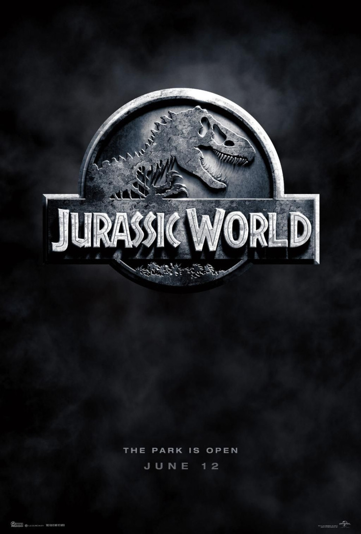
That initial book cover would remain the inspiration for the artistic direction used in subsequent sequels, although each film would make slight changes. However, it retained its similar look and feel. "Jurassic World 3" is expected to yet again follow suit and use a variation of the highly-recognizable logo.
© Copyright IBTimes 2024. All rights reserved.
- MOST POPULAR IN Entertainment


