Stunning Maps Visualizing Twitter, Flickr Usage (PHOTOS)
Programmer Eric Fischer has created maps that visualize Twitter and Flickr usages around the world.
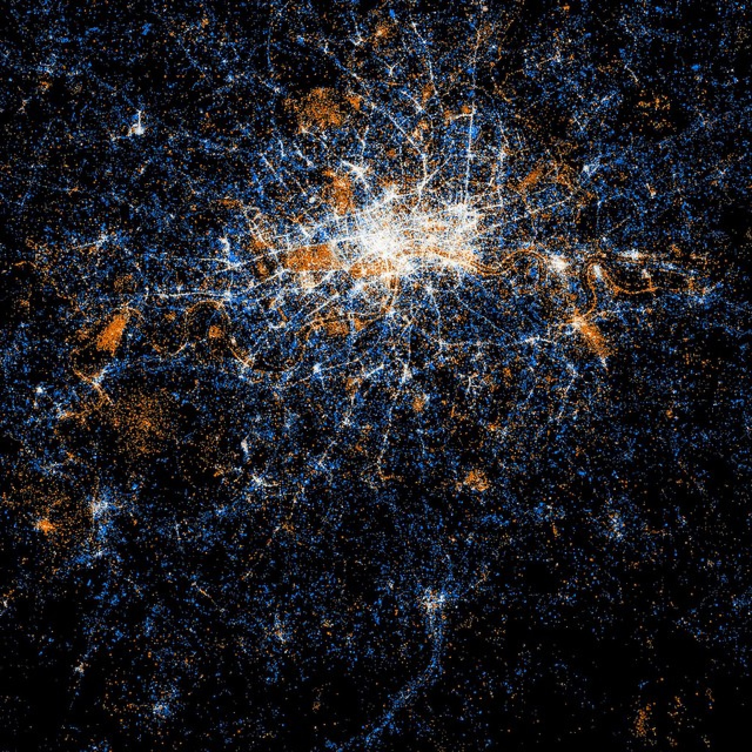
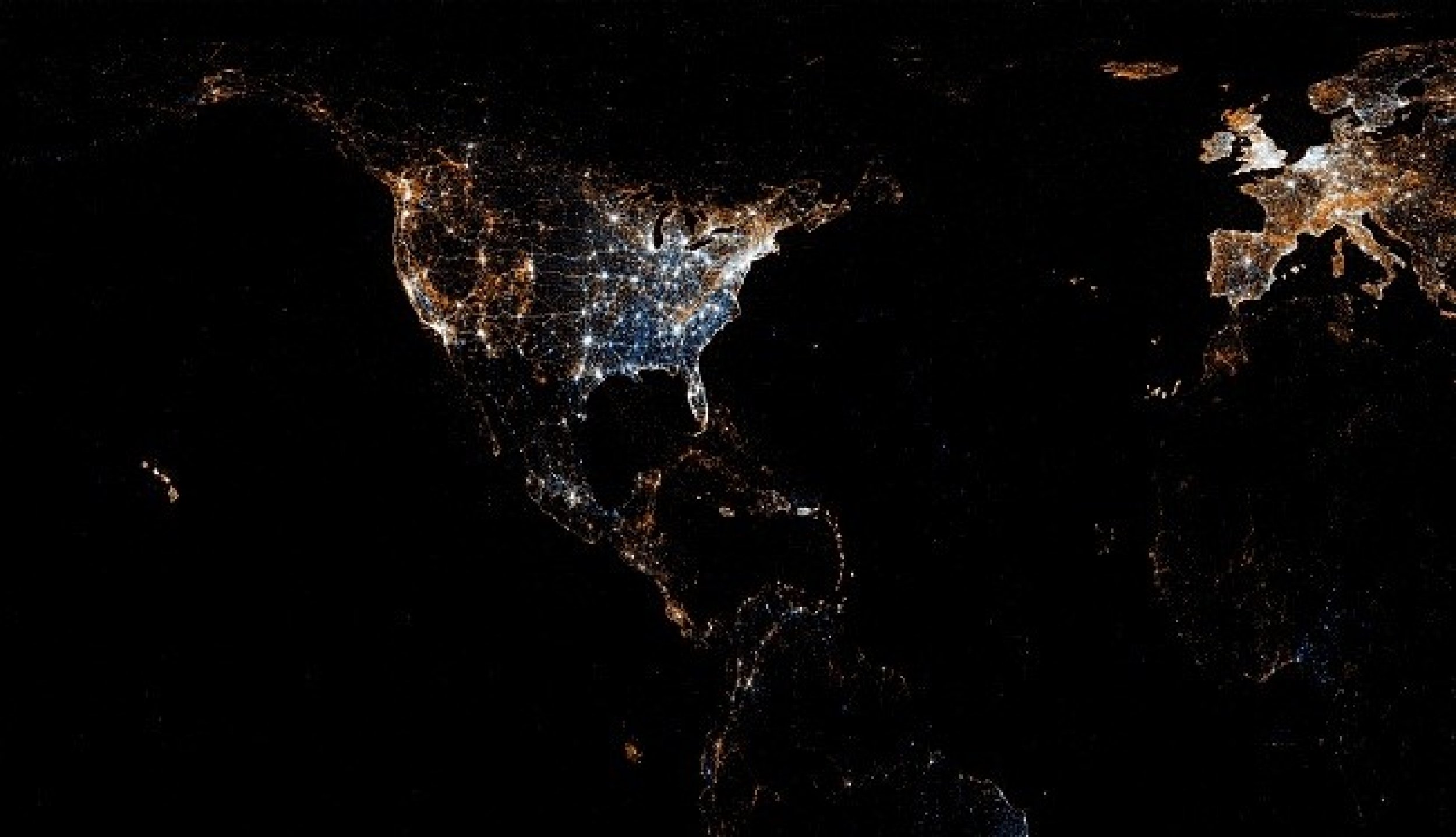
Fischer created the images by taking the geo-tagging location posts from the two websites and plotting them on a map.
The maps help one to find out where people are located when they post tweets on Twitter or upload a photo to Flickr, the photo-sharing website.
The California-based programmer got the Flickr data from the search application programming interface (API), while Twitter data was from the streaming API.
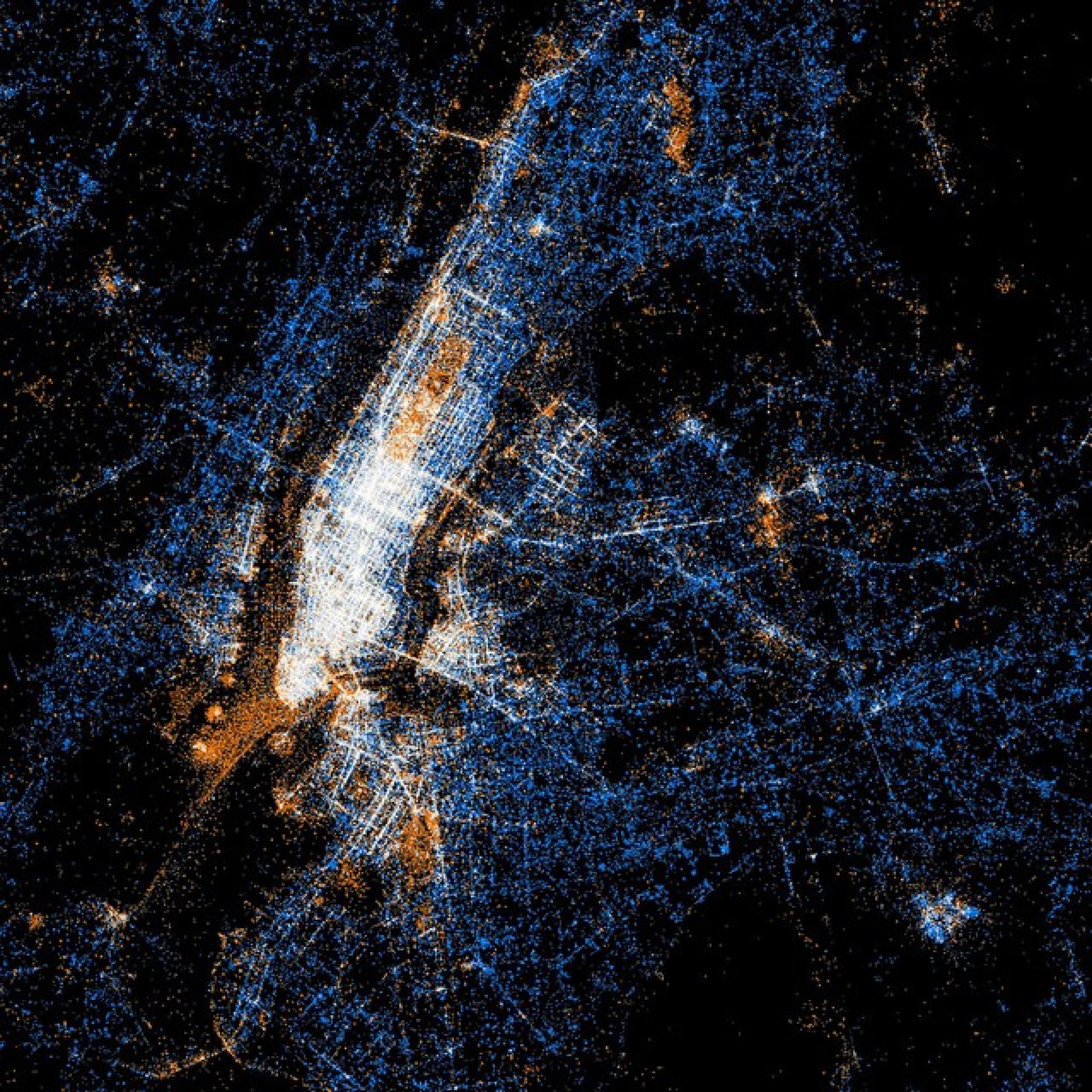
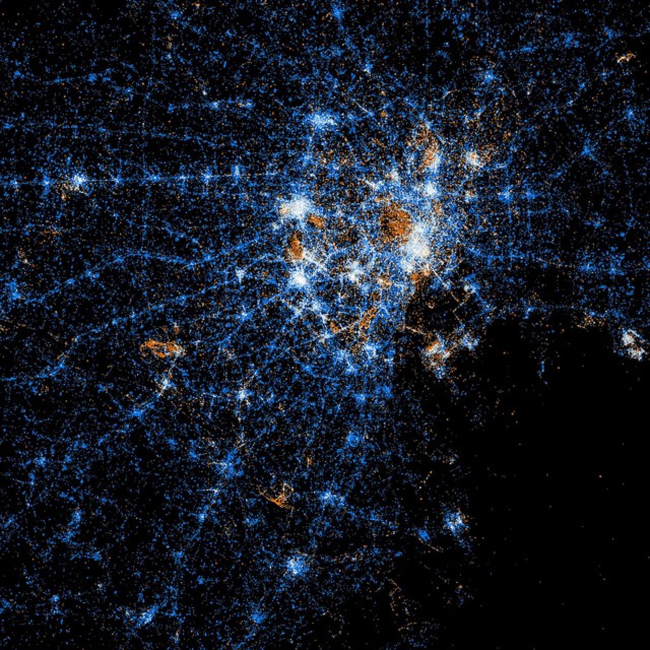
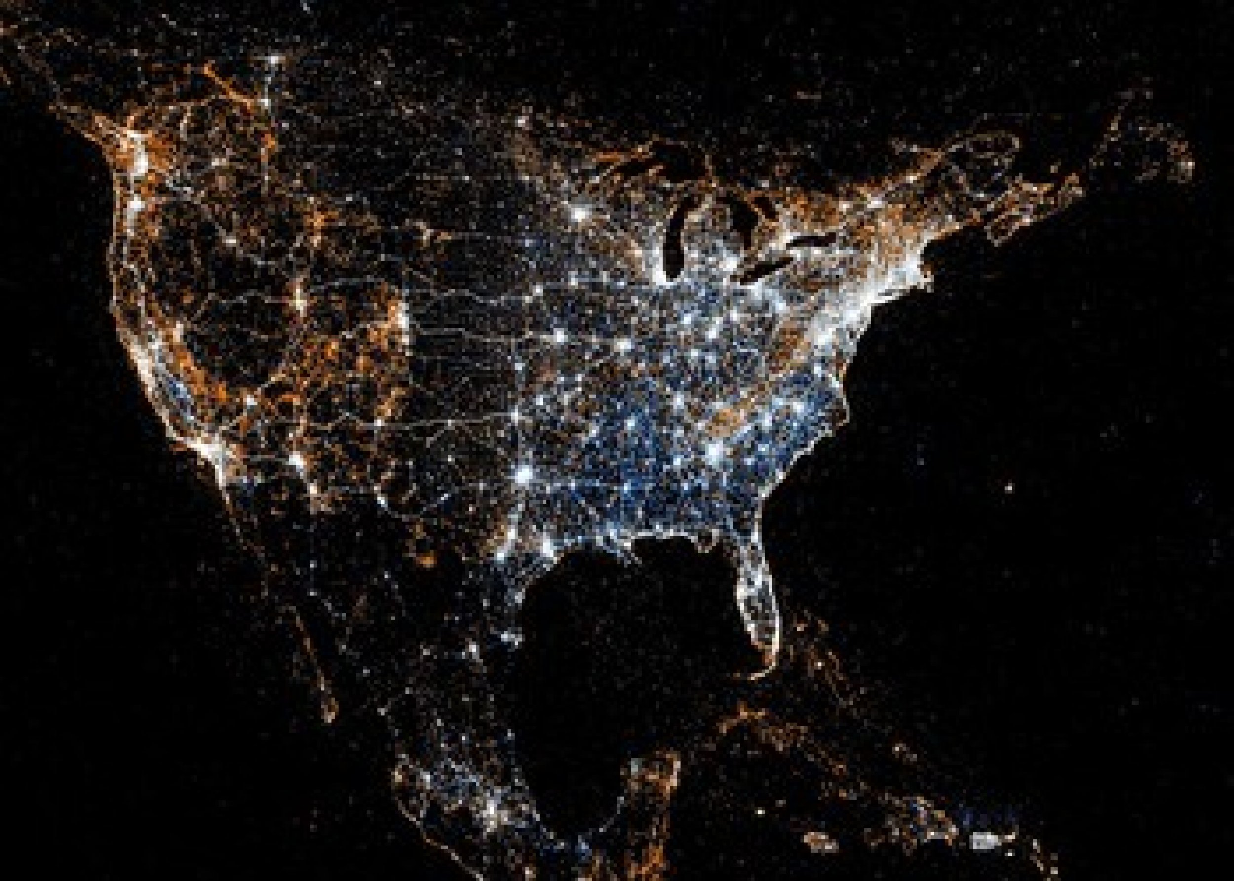
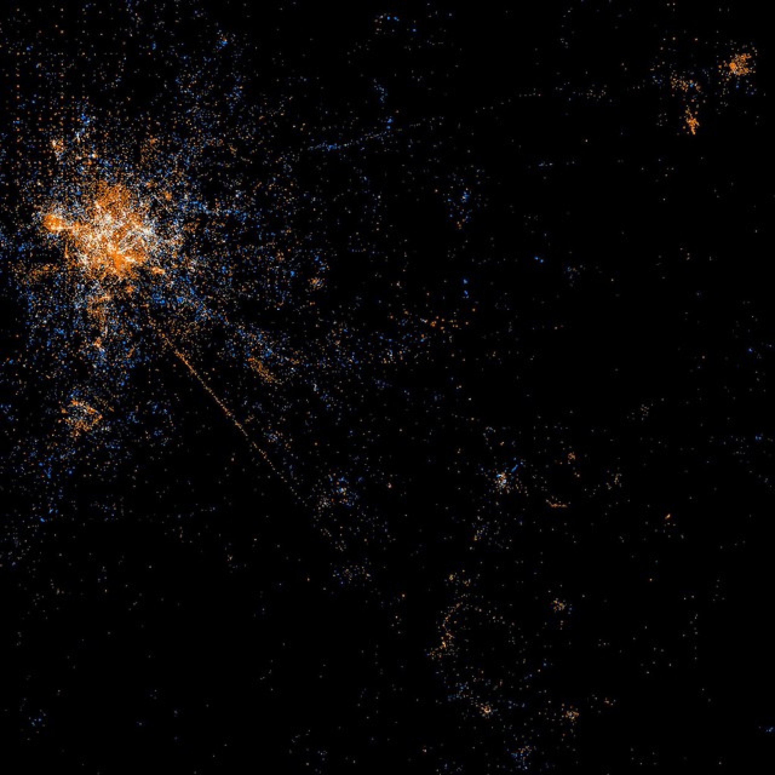
In the image, Red dots are locations of Flickr pictures. Blue dots are locations of Twitter tweets. White dots are locations that have been posted to both.
Fischer tweeted: I used a program that I wrote specifically for the purpose.
In his Flickr comments, Fischer said: Thanks! There's not a whole lot of technology behind it. It's a C program that runs through the photos/tweets in chronological order, plotting the earliest ones the most brightly and stepping the brightness down for points that don't show up for the first time until later on.
For Fishcher, it takes less than 45 minutes to create a map. He takes about 40 minutes to set up the file data from Twitter and Flickr APIs and three minutes to create the image.
Fischer said points are also allowed to diffuse by a few pixels when there is an additional record for a point that is already plotted, with the brightness falling off exponentially as the point that is actually plotted gets further from its intended location.
Each pixel is somewhat weird area of 2.25 square miles because a smaller area made the whole-world image too big for Flickr to let me post it, Fischer added.
Fischer has created maps for several U.S. cities, including New York, Chicago and San Francisco. Maps are also available for certain European cities like London and Paris, apart from Tokyo and Jakarta in Asia.
Following some of the stunning visuals showing Twitter and Flickr usage of various countries.
© Copyright IBTimes 2025. All rights reserved.


