Is The ‘Loki’ Logo Filled With Plot Hints For Disney+ Series?
Disney+ series “Loki” started quite the online discussion when Marvel Studios released our first look at the series’ logo, which featured the title, “Loki,” written in 4 different fonts. The conversation continued when they released a new set of alternate versions of the logo, all with different fonts.
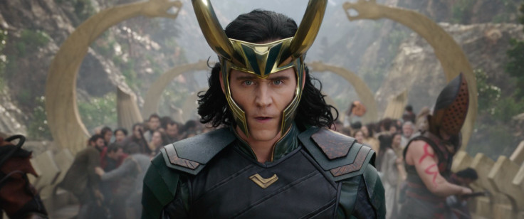
Marvel fans have taken to view this as an easter egg or a clue as to where the series is headed. So far, we’ve only seen the logo and a 3-second clip of Loki himself wearing a prison outfit with “TVA” printed on it. This could pertain to the “Time Variance Authority,” a branch of time cops that focus on keeping space-time in check. According to Screen Rant, this is just another piece of the puzzle.
Branching off of “Avengers: Endgame” into its own separate timeline, “Loki” features some element of time travel and/or the repercussions thereof, which was confirmed by executive producer Stephen Broussard in the Disney+ special "Marvel Studios: Expanding the Universe."
With that said, the different fonts used in the “Loki” logo looks like it was lifted from different eras of time. Each letter might represent a different point in time that Loki is visiting. How Loki might be time-traveling is unconfirmed, as he previously escaped with the Space Stone and not the Time Stone. But after he’s captured by the TVA, a force that uses their own form of time travel, Loki could find various ways of escaping custody and exploring many different times.
From what we saw in the Super Bowl ad, the fonts in the logo shift and change very quickly, suggesting there is some kind of timeline or reality meddling happening -- both things we’ve seen in the last two “Avengers” installments and are likely to see again in “WandaVision” and “Doctor Strange in the Multiverse of Madness.”
Whether this choice of font is just an aesthetic choice or one with much deeper implications remains to be seen until “Loki” hits Disney+ sometime in 2021.
© Copyright IBTimes 2026. All rights reserved.
- MOST READ