NASA Shares Beautiful Images Of Life On Earth As Seen From Space
As NASA marks 20 years of observing not just the physical properties of Earth from space, but also life on the planet, it shared an animation Monday that “captures the entirety of this 20-year record.” The visualization shows Earth as it moves through seasons and years, what the video’s narration calls “the most complete view of global biology to date.”
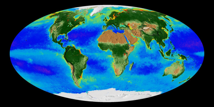
NASA began its continuous, global record of both land and ocean life in 1997 with the launch of the Sea-viewing Wide Field-of-view Sensor (SeaWiFS). The space-based view of life on Earth allows for monitoring the health of various ecosystems on the planet, as well as discovering long-term changes that take place across continents and oceans.
“These are incredibly evocative visualizations of our living planet. That’s the Earth, that is it breathing every single day, changing with the seasons, responding to the Sun, to the changing winds, ocean currents and temperatures,” Gene Carl Feldman, an oceanographer at NASA’s Goddard Space Flight Center in Greenbelt, Maryland, said in a statement accompanying the animation release.
The “repetitious ebb and flow on the land and the surface of the ocean” that can be seen in the animation is actually the planet breathing, the video tells us. Photosynthesis — the process through which plants take in carbon dioxide and convert it into energy, producing oxygen as a byproduct — happens roughly half on land and half in the oceans. And the video explains the changes observed.
The dark green portions on land are where plants are abundant, which happens in the spring and summer seasons. The light blue parts of the oceans are rich in phytoplankton, which are tiny plant-like organisms. During colder months, plant activity reduces, and this is especially noticeable in the northern hemisphere, where most of Earth’s land plants are. Carbon in the atmosphere increases in the winter as plants go dormant, the video says.
There are also extreme zones in the ocean. Some of them, appearing purple in the visualization, are essentially deserts, devoid of any phytoplankton. These “biological deserts” are expanding as ocean surface temperatures rise. In complete contrast, there are the red portions along coasts that indicate a high concentration of phytoplankton along the shoreline (however, these are sometimes other things that the satellites see as changing the color of the water).
Since plants and phytoplankton both reduce the net carbon in the atmosphere, studying them and predicting their future has direct implications for where the Earth is headed in a time when human activity is adding carbon to the atmosphere at an unprecedented rate.
Ivona Cetinic, also an oceanographer at Goddard, explained the importance of the 20-year data in the video: “It is this long-term dataset that allows us not only to see exactly what’s happening but gives us so much of a better way to predict what’s going to happen.”
© Copyright IBTimes 2026. All rights reserved.
- MOST READ