

Netflix Redesign Reveals New Logo And Website Interface

Laptop and desktop users logging into Netflix Inc.’s (NASDAQ:NFLX) website on Thursday evening found the video streaming service had received a significant visual overhaul.
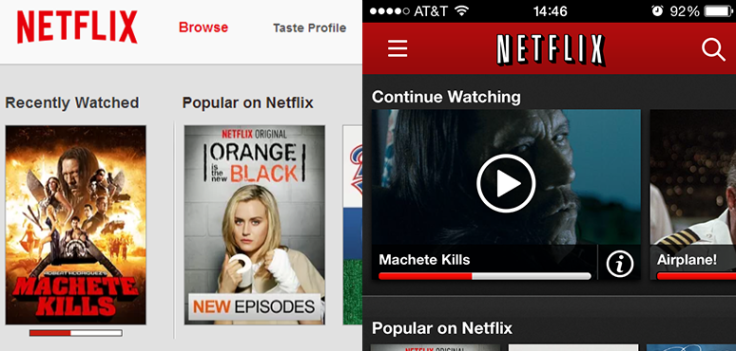
One of the most immediately visible changes is the new desktop browser interface, which eschews the heavy use of red for a subtle and flat white and grey layout. Likewise the Netflix logo has received a redesign: In place of its original white lettering bordered by a black drop shadow is a simplified design that sports flat red text.
The logo redesign actually made its debut last week, on the Season 2 premiere of HBO hit “Orange Is the New Black.”
Another change found in the redesign is the loading screen, which now provides a preview still of a film as it loads. Notably missing is the loading percentage, replaced by a lone spinning wheel.
The mostly cosmetic redesign affects only the desktop version of Netflix.
Last year, Netflix rolled out a revamped interface for its video game console and television apps in an attempt to make the streaming service more accessible and user-friendly.
Netflix hasn’t said when the logo and color-scheme redesign will make its way to mobile, tablet and console apps.
© Copyright IBTimes 2025. All rights reserved.
- MOST POPULAR IN Technology


