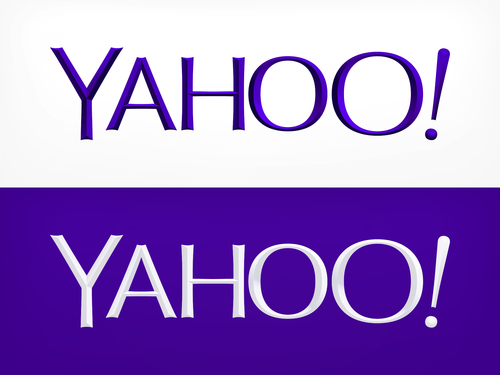
Yahoo Gets New Logo: After 30 Days Of Strife, A New ‘Whimsical’ Icon Is Crafted

Putting an end to a 30-day-long endeavor, Yahoo (NASDAQ:YHOO) finally revealed its new corporate logo on Wednesday, as part of CEO Marissa Mayer’s attempt to bring in some freshness to the popular but ailing Internet pioneer.
The new logo retains the original purple color and the all-caps format on a white background, but it does away with the old serif-like font for a sans-serif appearance, distinctively elevating the interior of the letters. An alternate version of the logo includes a white-colored font on a purple background.
“We knew we wanted a logo that reflected Yahoo - whimsical, yet sophisticated. Modern and fresh, with a nod to our history. Having a human touch, personal. Proud,” Mayer said in a Tumblr post on Wednesday, describing the process of crafting the new logo, which comes with an interesting twist -- a dancing exclamation mark.
Whenever the page is refreshed, the iconic exclamation mark appears dancing around half of the logo and then sits at the end of the company name.
According to Mayer, the design team did not want straight lines in the new logo as “straight lines don’t exist in the human form and are extremely rare in nature, so the human touch in the logo is that all the lines and forms all have at least a slight curve.”
In addition, there were preferences also for a mathematical consistency and letters with thicker and thinner strokes, while preserving the trademark Yahoo yodel. The designers also tilted the exclamation point by nine degrees “just to add a bit of whimsy.”
Mayer said that a poll among employees was also conducted to understand what changes they wanted on the Yahoo logo, which had not been updated in 18 years. According to Mayer, 87 percent of the employees wanted the logo to undergo some sort of change.
Motorola recently updated its logo by including a colorful circle around the traditional “M” and a tagline proclaiming it as “a Google company.” Microsoft (NASDAQ:MSFT) introduced its new logo last year by retaining the Windows logo, but with the edges squared off.
© Copyright IBTimes 2024. All rights reserved.


