Positive Employment Report Data Nothing To Cheer About
ANALYSIS
The ADP employment report out Wednesday morning seemed to have a bit for everyone.
Optimists cheered the headline number, signaling an estimated 163,000 added to the private payrolls, could be a presage to a positive release on Friday, when the Labor Department will note its own -- and much more consequential -- estimate of job creation in July. That 163,000, the bulls were screaming this morning, is a huge 'beat' on the 120,000 consensus estimate of economists surveyed by Bloomberg.
Pessimists, in the meantime, are yelling "hogwash." First off, ADP releases an awful yardstick when forecasting government data.
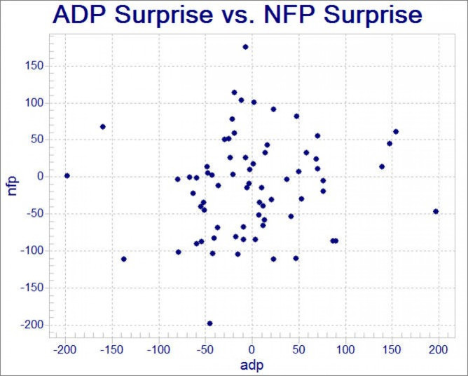
"The ADP report has differed from the BLS private number by an average of about 50k so far in 2012 with no clear directional bias," Cooper Howes, an economist for Barclays, wrote in an email after the results were released. And a divergence of 50,000 is actually pretty good for the report, as the chart below -- a re-print from financial blog ZeroHedge -- shows
Second, the much-vaunted recovery in manufacturing, which was widely heralded over the winter and early spring as the one ace-in-the-hole that could put the economic recovery in the U.S. in orbit, is clearly faltering: the level of employment in manufacturing, according to the report, stands at the same level it did in March, even though the economy has created nearly 300,000 jobs in other sectors since then.
A slightly more nuanced view of the data seems to hand the case to the bears. For one, as even ADP shows in the charts accompanying its monthly report, its payroll count is not necessarily a spot-on proxy for the government numbers, but is excellent at predicting general momentum, showing a correlation of 92 to 95 percent with government data.
In that regard, the ADP payroll numbers were actually negative. Yes, they blew away analyst expectations, setting up what Paul Dales, senior U.S. economist at Capital Economics in London, called an "upside risk" in a note to clients. But they also show growth in payrolls was declining across all sectors of the economy. In places like construction and mining, which includes fracking-driven expansion in the natural gas sector and housing recovery gains, the drop was steep.
The last time this happened, in March, market-watchers were badly disappointed with the Labor Department payrolls release. Forewarned is forearmed.
© Copyright IBTimes 2025. All rights reserved.
- MOST POPULAR IN Analysis